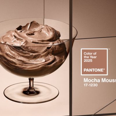
Dulux's 2026 Colour Forecast: The colours we'll soon be seeing everywhere
How do you connect with your inner sense of calm?
For many of us, the notion of a retreat or escape gets the heart rate down.
Some find peace in organised chaos or loud self expression.
Regardless of how you seek serenity, one thing is obvious … we all want stability and peace in our homes.
The Dulux Colour Forecast for 2026 reflects this shared desire. The annual report predicts colour trends for the year ahead, giving a glimpse of the palettes set to shape our spaces.
In 2026, the forecast suggests home owners will embrace hues embodying calm and connection – with ourselves, others and nature.
“We’re seeing a continued preference for warm, comforting colours in this year’s palettes,” says Andrea Lucena-Orr, colour and communications manager at Dulux.
“Colour has the power to lift spirits, offer emotional reassurance and bring a sense of calm into our homes.”

Whether you’re planning a full home renovation or looking for a quick, easy way to uplift your interiors, there’s a hue to suit you.
The peace of pastels
This palette is called Dulux Ethereal for a reason: it is all about whimsy and escapism.
Inspired by fantasy fiction, its combination of hues is gentle yet playful and uplifting.
“Dulux Ethereal features a delicate, pastel-like blend of soft and mid-tone hues – gentle greens, mauves and blush pinks – that evoke a sense of serenity and joy,” Lucena-Orr says.
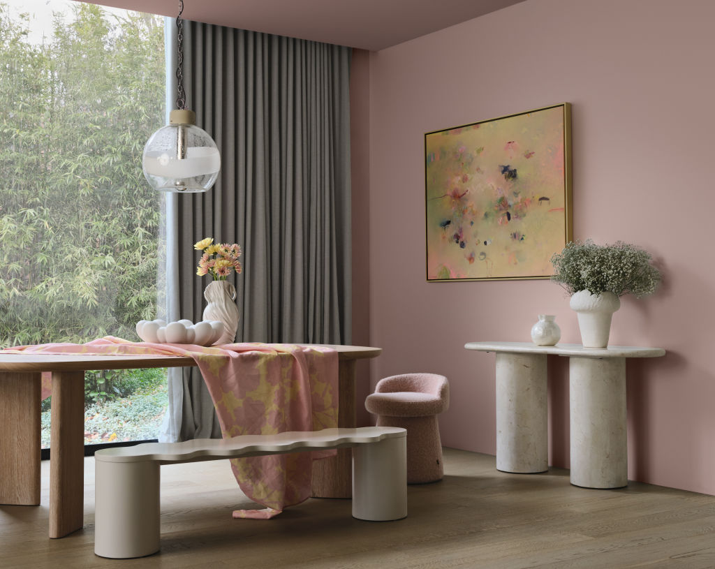
Soft and inviting, this palette pairs perfectly with materials like soft oak, bleached wood and plush fabrics.
“Shiny surfaces like glass and chrome bring light, while sand-blasted textures soften the shine, creating a dreamy, layered look,” says Dulux colour and design manager Lauren Treloar.
Warmth to counter burnout
Dulux Elemental is a brutalist-inspired palette featuring warm whites, greys and neutrals, with golden brown highlights.
“Subtle layers of grey … bring stillness and structure, while darker charcoal tones add depth and dimension,” Lucena-Orr explains.
“The result is a timeless, cohesive palette that feels quietly confident.”
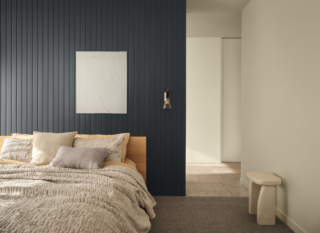
For those looking to integrate the palette into their own homes, opt to pair it with durable materials that combine style and practicality: clean linens, raw concrete and polished marble.
Chrome and aluminium can also bring an industrial feel, which you may want to soften with copper details and warmer tones.
Joy found in self-expression
Optimistic and bold, Dulux Evoke celebrates individuality with a touch of nostalgia.
The palette is best suited to homes with interiors inspired by the 1950s, ’60s and ’70s.
“Dulux Evoke favours eclectic, character-filled styling,” Lucena-Orr says, adding that this interior design style “features vintage-inspired materials, handcrafted elements and curated clutter, making spaces feel alive and layered, adding to our collections over time.”
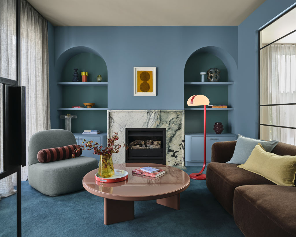
It’s a style that is especially popular with Gen Z, who typically gravitate towards clashing prints and louder colours.
Consider choosing materials like chrome and aluminium while layering colours like blush pink, burnished orange and warmer golden tones.
You can add depth with deeper purple and red hues.
Inspiration to help you bring these palettes to life in your home
Looking to change things up in your own space? Get inspired by these homes that expertly use colour.
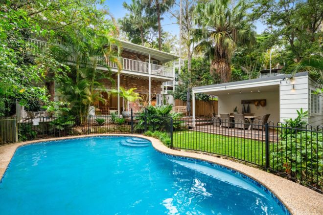
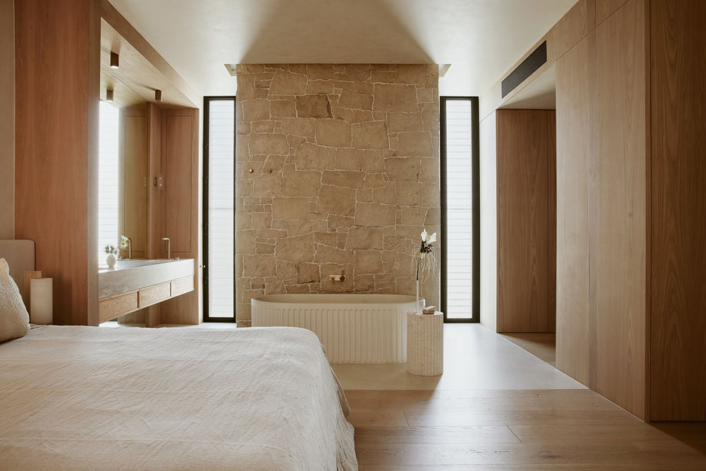
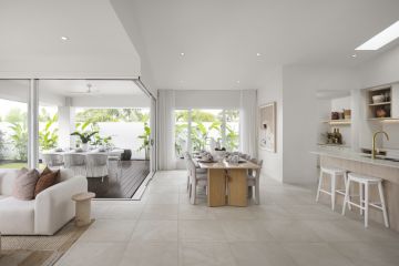
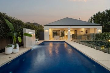
This five-bedroom coastal oasis sits in Avalon, a Sydney suburb known for its stunning ocean views and laid-back lifestyle. With a pool and al fresco area, the home blends soft tones with lush greenery and playful prints.
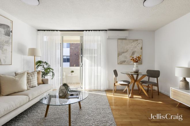
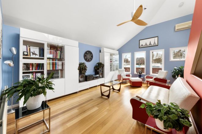
Natural light floods this two-bedroom apartment, amplified by the use of white, neutral hues paired with timber flooring and pops of burnished orange. The property has an internal laundry and modern appliances to maximise convenience.
This bright Fitzroy home comes with its own rooftop terrace, has a lock-up garage, and is a short walk from Brunswick Street’s dining and entertainment options.
We recommend


We thought you might like

States
Capital Cities
Capital Cities - Rentals
Popular Areas
Allhomes
More
- © 2026, CoStar Group Inc.
