Five home trends I hate because they're trendy
As your mum and countless teachers and mentors have probably told you time and time again, it’s neither big nor clever to hate something just because it’s popular. I learned this the hard way when, at the age of nine, I sounded off about 90201 and quickly found myself without any friends.
When it comes to home decor, however, there are some trends that are so omnipresent it’s almost unnatural not to start to feel resentful.
In a blistering screed for New York Magazine’s The Cut, Jamie Lauren Keiles laid into succulents, the bane of her personal home decor life: “In the same way that a baby’s oversize head and round eyes provoke empathy, the plump and whimsical leaves of these desert plants felt undeniably cute. But as with babies, more plants does not necessarily equal more cute. One baby? Adorable. Hundreds of babies in twee upcycled teacups atop every coffee-shop table and windowsill in your neighbourhood? A nightmare.”
Though I can’t say I share her loathing of succulents (they’re just too cute), I have been inspired by Keiles’ piece, and a safe space has been opened up, within which we could express our deepest feelings about certain homewares. Please, won’t you join me?
Metallics
Listen, I’ll level with you, I’m not immune to this: I bought a few of those shiny, rose-gold “paper bags”, too! But with the metallics trend is extending to high-shine cushions (sweaty!), doona covers (like sleeping in a burrito wrapper!) and cookie jars (just eat them out of the packet, you liar!), homes are starting to look more like something you saw the last time someone spiked the punch.

Photo: The Future Kept
Pantone Overload
Feature walls daubed in the Colour Of the Year, mugs bearing your “favourite” Pantone shades, keep cups, food trays, coffee pots: enough! “The world-renowned authority on colour” has somehow managed to make its way into the kitchen cupboards of Joe Public, to the extent that there are now fake “Pantone-esque” colour block mugs in bargain shops. We get it, you’re into minimalism and graphic design: doesn’t mean your house has to look like a series of paint chips.

Photo: Pantone
Statement Mirrors
My housemate and I spend, on average, at least 10 minutes each week discussing the terrible statement mirror –a collection of four wavy lines that look like one of the symbols from The Fifth Element, except less cool – that our landlord saw fit to install in our dining room. Mirrors are functional things: they’re for extending the space, or taking selfies, and little else. If you must make a statement with a piece of mirrored glass, why not a beautiful Victorian gilt frame rather than something in the shape of a daisy?

Photo: Lonny.com
Black Stainless Steel
I appreciate the look of a matte-black sports car as much as the next revhead, but there’s something about a kitchen full of imposing appliances the colour of asphalt that feels a little too much like Darth Vader did the interior design (without any of the cool extras that might come along with that, such as planet-destroying lasers or 1970s lighting).

Photo: Therese Knutsen
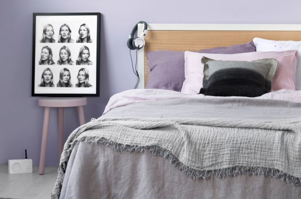
Pastels
…Having said that, I’m also no fan of the sorbet-toned homewares (and walls) that have spread like wildfire over the past year, a trend that shows no sign of abating. A hint of lavender or duck-egg blue here and there is nice, but do you really want to live inside a giant candy-coloured cloud where everything is fun yet non-threatening? Does that wrought-iron stool really need to be spray-painted the colour of unsalted butter?

Photo: Haymes
We recommend


We thought you might like


States
Capital Cities
Capital Cities - Rentals
Popular Areas
Allhomes
More
- © 2025, CoStar Group Inc.
