How to decorate with patterns and prints
Simple styling and stark minimalism may be dead chic, but nothing screams confidence or maximises a room’s impact like myriad artfully mixed prints. “Mixing bold patterns and prints can be daunting,” says Hailey Mitchell, co-owner of online interiors store Milly and Eugene, “but when mixed properly, it can create an edgy, eclectic, yet homely feel to any space.”
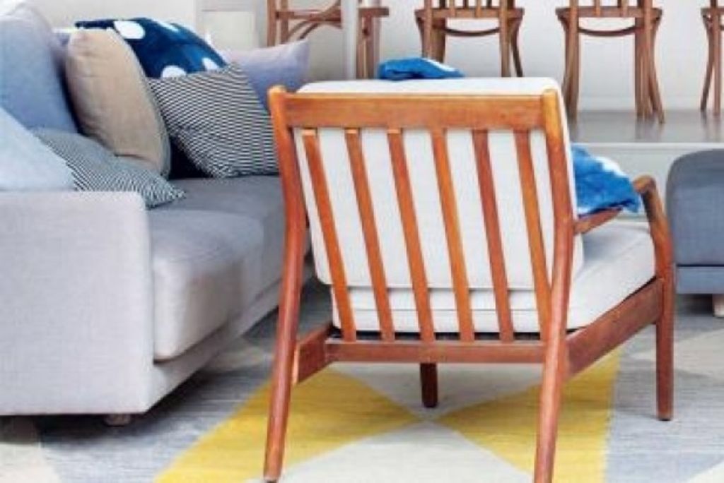
If the thought of layering prints leaves you scared stiff, start small choosing your colour palette carefully, and then temper it with easy neutrals. “Don’t be scared to experiment,” she says. “Take baby steps when first starting out, and use your expensive items, like sofas and beds, to act as a neutral base. It makes adding prints easy; just throw in a few scatter cushions and throws, and you have changed the look of the room in a flash.”
Optics, florals, spots and stripes are easily assimilated if you determine your colour thread from the start. “Find a print you love, and take from it your favourite colours,” says Mitchell. “Mixing different shades of a common colour will lead to an evolved, seamless look.”

Photo: Milly and Eugene
Look for mutual colours in your prints that will tie them together, making mingling a cinch. “I generally work with two to three [colour treads] to tie their dissimilarities together, but never just one because it feels too random,” says top interior stylist Megan Morton of The School. “Sit in a safe colour scheme, and play with the luxuries that a tight palette affords you.
“Don’t choose a colour that is too bold for you to handle. It’s hard; a bit like trying to cut your fringe straight when you have started off-crooked. Don’t go for bolds if you then need to make them modest. They are not invisible assets; they pave the way for the room, so watering them down is useless.”
Once you have embarked on a colour trajectory, consider the scale of your prints. “It’s important to find a common element within your prints and patterns,” says Mitchell. “When mixing prints, try not to choose more than one of the same scale; it can look cluttered.”

Photos: Milly and Eugene
Consider the context of the space you are working with, being realistic about your capabilities, and how challenging your prints are to coordinate. “Scale is instinctive,” agrees Morton. “I would only tap into what I thought I am capable of handling – or what the room is capable of. For example, a large Victorian room with soaring ceilings, paneling and architraves is going to be able to take on more than you might be personally able to.”
No matter how complex your mix, a hybrid of prints and patterns can create a distinctive and bohemian space that finds energy in its juxtaposition. “Polka dots and stripes work well with bolder, busier patterns and prints,” says Mitchell. “They can work as a more neutral element in your scheme. Regardless of what you choose, just keep that colour theme in mind.”
When you are done, one thing you can be sure of is vibrant unpredictability. Mixing prints and patterns successfully, without losing your spots, is a mark of true style; now go forth and mingle.

Photo: Megan Morton
We recommend


States
Capital Cities
Capital Cities - Rentals
Popular Areas
Allhomes
More
- © 2025, CoStar Group Inc.
