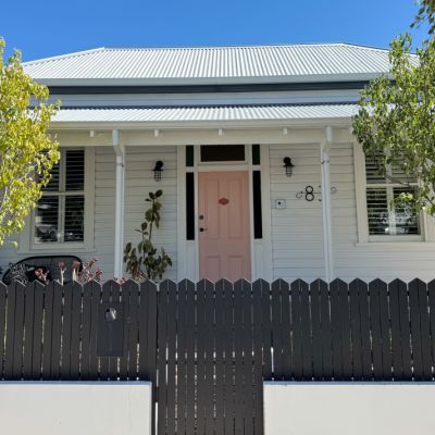
When it comes to interior design trends, yellow is the next colour to pop
Adelaide Bragg’s identity was shaped in childhood on the vast plateau crowning Rossgole mountain. From a scenic vantage point near the family homestead, unfettered views across paddocks and hills revealed a distinctly Australian colour palette, which was imprinted forever in Adelaide’s mind’s eye.
Muted emerald foliage from red gum, grey gum and white box contrasted with the vivid blooms of her mother’s English-style garden, a verdant oasis that surrounded their home like a patterned skirt from another land. Summer’s sun-bleached native grasses, deep shadows and blinding highlights softened to a pastel blur on the far horizon, the land and the sky joining in a symbiotic union. The valley below had its own colour scheme, with deep pink sunsets and red dirt tracks leading the eye to the indigo layers of the Great Dividing Range.
At the beginning of her career in the early 1990s, Adelaide worked at Colefax & Fowler in Sydney under the tutelage of Australian designer Martine Burns. A number of those lessons continue to influence Adelaide’s work today. “Martine used to say that a room needs something to muddle it up, that imperfection can make perfection.” That guidance aligns with Adelaide’s vision today and her affinity with the imperfections found in the natural world. A torn autumnal leaf, the tiny idiosyncrasies found in handmade seagrass wall coverings or artisan-blocked textile patterns are equally appealing to her eye.
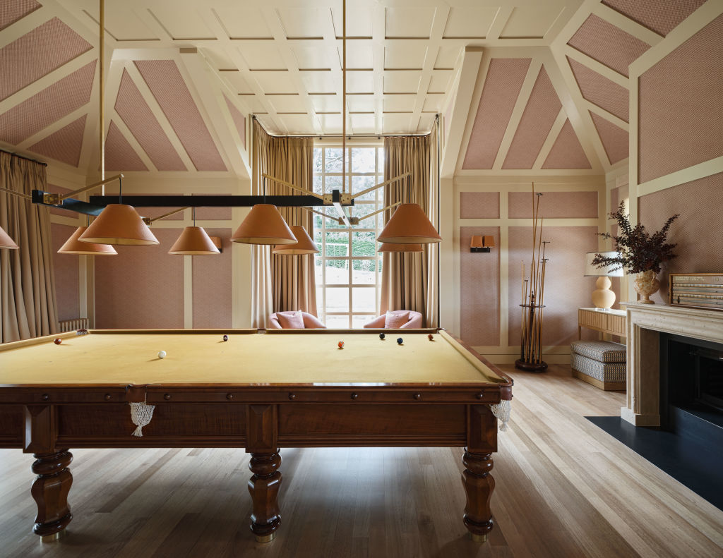
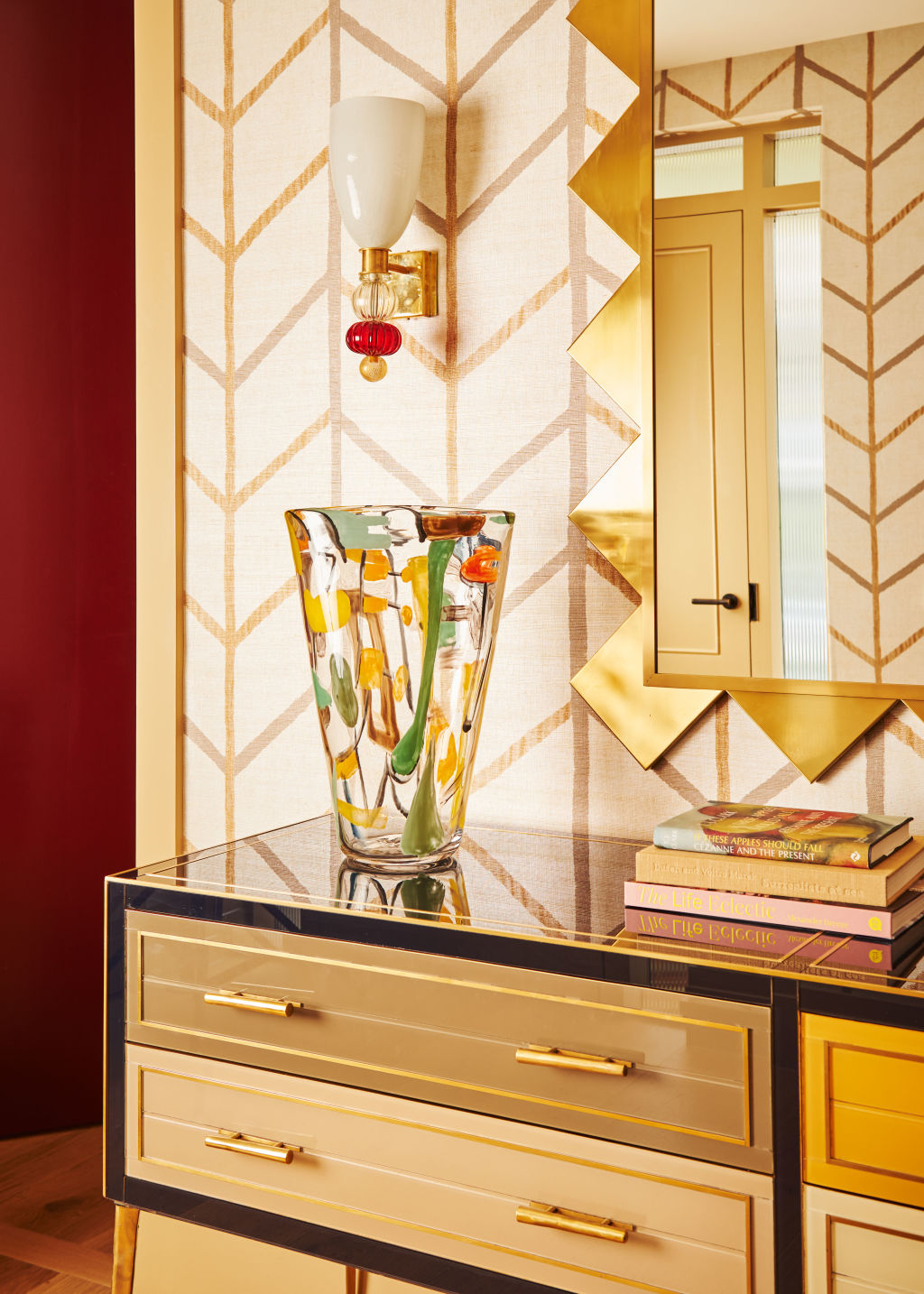
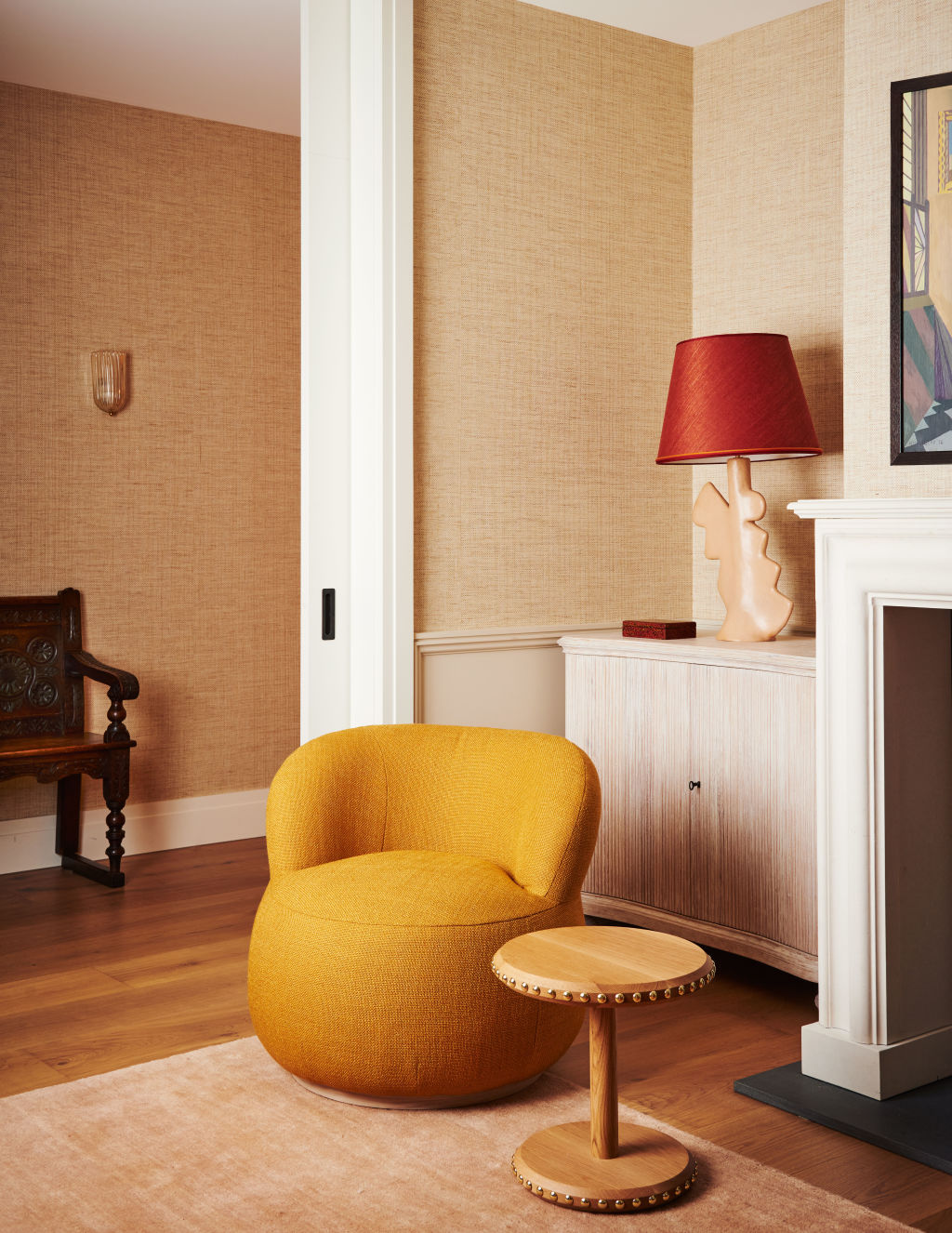
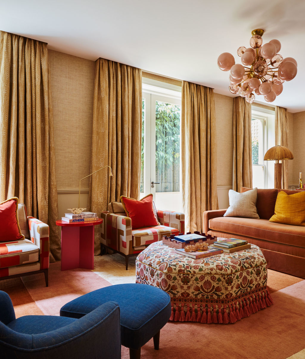
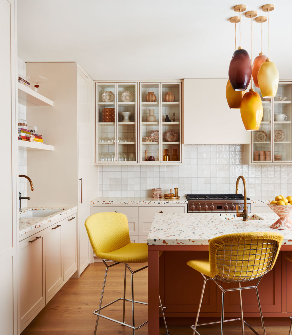
Adelaide frequently incorporates a painting, cushion or rug into a room to create an unexpected clash with the overall design scheme, piquing visual interest. Often, she’ll introduce a single vivid colour, like mustard, to give a space a cultivated vibrancy. “These are joyous colours, and occasionally, if a room is a little dull, we throw the mustard yellow in, and it goes, ‘Ding!’ There is a certain shade of yellow that works in almost any environment.”
While these rich and deep yellow tones are relatively recent additions in Adelaide’s chromatic lexicon, their associations hark back to some of her earliest memories. “Buttery yellow is a colour that I love living with. It’s the same shade as the fresh cream brought up from the dairy each morning in tin pails when I was growing up. It was a brighter yellow and thicker consistency than the cream you’d buy in shops. We’d have it with everything, and Mum would also use it to make the very best butter. So, for me, yellow is a happy colour and provides a pop of sunniness that feels joyous.”
Added to the palette she loved at home were the sun-kissed hues of the small seaside town of Terrigal, where the family would holiday for a month each year at their beach house. Aside from the relief of escaping Rossgole’s high-summer heat and flies, Adelaide loved the fresh sea breeze and delighted in the bleached timber and caramel coloured sand on offer there.
This may be the origin of her signature soft caramel, a colour she blends perfectly with other shades. “If you add the caramel, all of a sudden everything else pops. It provides a base that allows you to be brave with strong colours. That grounding tone ensures the really saturated hues, like a very strong yellow, can be truly liveable, balanced and easy on the eye. It is not as massive a jump visually from an earthy colour to a bright yellow as it would be from white to something supersaturated. You can be brave with strong colour in a space when it’s balanced, and the surfaces have a natural weave or texture.”
When Adelaide isn’t using colour to add an element of perfect imperfection into a room, she’ll sometimes introduce a contrasting pattern, like checks, to give a space more personality. In recent times, she has also embraced spots, which speak to the halcyon days of her childhood years in the family home. She vividly recalls finding a sheet of newly minted stamps on her father’s desk. Printed down one side, like little spots of joy, were a series of technicolour circles used by the printers to check the reproduction of each hue. Adelaide stopped in her tracks: she recalls feeling electrified by the colours and she recognises now that it was a defining creative moment in her early life. It’s this level of excitement and delight that Adelaide seeks to share with her clients when using golden hues.
We recommend


We thought you might like


States
Capital Cities
Capital Cities - Rentals
Popular Areas
Allhomes
More
- © 2025, CoStar Group Inc.
