Amazing design: When every little bit counts
Taking a much-loved but small old shoe-box and creating the illusion of a commodious, contemporary shoe-store is an unwritten constant today in renovation briefs involving workers’ cottages in the inner city. Understandably, renovators hope to maximise every square metre.
What’s not as constant, is how creatively, and appropriately, this expansion is achieved. We’re all familiar with the inappropriate, the pimple-on-the-pumpkin reno sadly still seen all too frequently.
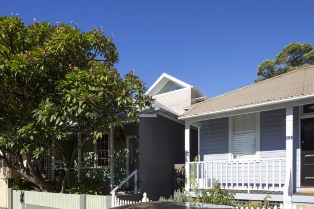
A recent renovation in Balmain of a small, 102-square-metre house on a compressed site of only 175 square metres offers a successful example of a discreet, creative renovation achieved on a modest budget.
Brief
The clients wanted to expand their two-bedroom, simple single-storey 1880s cottage – original weatherboard to the street and with a brick extension to the rear. The renovation should be contemporary but sympathetic to the existing house and street – a balance between not too severe and not too twee. It should house a new master bedroom, en suite and study.
Challenges
The east-west running site was tight with a sandstone wall to the rear, street and the western sun to the front, and houses pressing hard either side. Sitting in a heritage conservation zone, it faced all the usual constraints. And, in addition, budget was tight. The house itself was dark internally, with a gun-barrel hallway running front to back.
“Fitting the additions into the existing building fabric was quite a challenge, and required a good understanding of how buildings were built more than 100 years ago, and knowing what existing building fabric we could rely on,” architect Andrew Benn of Benn and Penna Architecture says.
Solution
With little space at the rear to play with, it was a no-brainer that the addition should go up discreetly rather than out, with no expansion of the existing footprint.
From the street, the new upper level appears as a gentle, contemporary timber-clad addition carefully integrated into the existing building’s roofline.
To complement the old, Benn wrapped the addition in western red cedar weatherboards. To distinguish the structure as new, he chose mitre-cut, narrower, lime-washed boards rather than painted.
“It’s a subtle variation but with clearly a contemporary character that presents to the street a lighter, more finely grained addition on top of the existing,” Benn says.
Internally, little work was undertaken downstairs. Two existing bedrooms and a bathroom, and living/dining/cooking spaces at the rear were left relatively untouched. The exception being the insertion of floor-to-ceiling rear doors to the courtyard, north- and south-facing windows, a light-well used to drag light into the previously dark ground-floor bathroom, and creation of a centrally positioned set of stairs from the kitchen to upper level.
Benn adopted a split-level approach and the creation of “views through views” to increase the sense of space and pull light into all areas of the home. A mezzanine study was positioned overlooking the kitchen and living, and a light-filled master bedroom and en suite above.
Again, to avoid any sense of imposing a heavy second storey on a small structure, and to maximise the illusion of a large space, Benn used double-height volumes to great effect – with a maximum ceiling height of seven metres in the corridor.
The overall effect is of a light hand, creating a warm, surprising commodious family home.


We thought you might like


States
Capital Cities
Capital Cities - Rentals
Popular Areas
Allhomes
More
