Vibrant colours are staging a comeback
For years, the neutral look has reigned in interior design. Beige, gray, straw, light brown – the hues are as pale and cool as a Scandinavian winter. Even accent colours have stayed on the muted side.
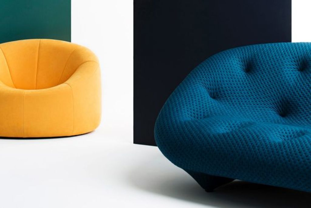
The tastefully restrained look hasn’t been dethroned yet. But lately, vibrant colours are staging a comeback, at least in well-chosen accent positions. In the media of paint, metal and textiles, dramatic primary colours are being added like lively grace notes in bathroom fixtures, accent walls, kitchen stools, couch pillows and other small but high-profile places.
“Modern interior decorating colour trends mix classy black, white and gray … tones with romantic pink and mysterious light purple colours,” said Lushome in its assessment of 2016 colour trends. One combination it identified was “spring-inspired yellow and green colours with neutral beige and white.”
More dramatic colours are also making inroads, according to Lushome: “Deep orange colours … look gorgeous with contrasting black. Peaceful blue and green colour combinations, red wine colours, bronze and comfortable brown colours can be mixed into modern interiors.”

Textile designers are also using more patterns and colours. Photo: Linen House
Textiles, formerly stalwarts of the neutral look, are getting colourful, too – and more adventurous. According to House Beautiful, textile designers are beginning to use patterns and colours from indigenous artisans in far-flung parts of the world. “Trending presently is Guatemala, where colourful weaving has been part of the fabric of Mayan life for thousands of years,” House Beautiful reports.
Some designers see bold colours reappearing in metal accents. Rose gold, brass and copper are becoming popular in kitchens and bathrooms, according to London-based interior designer Gemma Gordon-Duff of Gordon-Duff & Linton. She often uses them with marble, wood and other natural materials.
The reappearance of bright colours, even if on the margins of interior home design, can’t come a moment too soon for Shannon Wilkins of Prairie Home Staging and Design in Los Angeles.
“If I see one more white kitchen with a gray counter I will scream. People are getting sick of having the same kitchen as everyone else.”

Dramatic colours help create a more personalised statement. Photo: Hamyes Paint
Wilkins is trying to break with the tendency to dress staged homes in a relentlessly neutral (and therefore inoffensive) palette. She is opting for more colour and, by implication, a bolder and more personalised statement.
“I stage homes for developers. I’m trying to put in globally inspired designs. I love some of the things I see at 503found, such as a hot-pink-and-orange rug. It’s a great store to look at what’s going on in the rest of the world.”
Kim Rodosky, the owner of 503found in Newport Beach, California, says a lot of designers are looking for the same accent colours as Wilkins. It’s being driven by a desire for less homogeneity in home design, she thinks.
“A couple of years ago I started to see brass coming back, and other colours. People are just going away from wanting a home that looks like it was done at a one-stop shop.”
Rodosky says the current colour trend, like so many new ideas that seem to take hold instantly, came from social media.
“I think it started on Pinterest and Houzz, where a lot of people go to look for new ideas. Right now I sense people want interiors that have more interest. They don’t want a home where everything ‘goes’ with everything else.”
Originally published on The Orange County Register
We recommend
We thought you might like

States
Capital Cities
Capital Cities - Rentals
Popular Areas
Allhomes
More
